A theme is something that helps in defining your business to your users/customers. It ensures consistency in the design and tells a lot about your brand with the help of colors, icons, elements, images, etc. A good theme can attract people, add a feel-good factor to the website or app and even make them stay or return to your website more often. On the contrary, a bad theme can make them search for or jump to another better option.
It is best for designers to follow a minimalistic approach to creating theme. If the design contains a lot of information that is irrelevant or rarely needed then it will increase your theme’s size and website loading time significantly.
Let us learn how to create the perfect design themes for your brand that is minimalistic, simple yet attractive, and contextual.
Start with choosing colors for your theme
A theme is a combination of many design elements like color, typography, icons, scale, etc. Out of which, color plays a crucial role in the success or mass appeal of your brand/product.
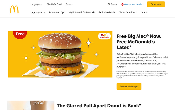
In the example above, McDonald’s is using yellow and red as their main colors. The color red is stimulating and is associated with being active and the color yellow is associated with happiness and is the most visible color in daylight.
Colors help to represent your business and brand to users and it also creates a brand identity. You can use these as primary and secondary colors all over your design.
Pick images that best represent your business
As Henrik Ibsen, a famous playwright-director has said “A picture is worth a thousand words”.
With the help of images, you can share your thoughts without the use of any words. Also, our brain can read and understand the context of the images faster than written words. It not only makes the design attractive but also reduces the efforts of users to read. Selecting images that are related to your business is also part of the theme, and it helps in recognizing the business better.
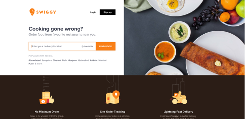
In the example above, we can easily tell that this website is related to food or restaurants even before reading the details just because of the images used here which are helping us to recognize the type of brand or business Swiggy is.
Selecting the type of icon for your design theme
Icons are graphical representations that help in conveying the information to the users quickly. Icons’ types can be solid and hollow, you can use any of these according to your theme and the information you want to convey through your design.
Some points to note before choosing the icons:
- Icons should be easy to recognize.
- Don’t redefine the meaning of the icon.
- Icons should have visual consistency (stroke, size, and color).
- Use icons that are familiar to your users, i.e., use the universal icons.

Buttons and elements
The button always plays a big role in the design of the theme. Having a call to action (CTA) button is important on every page or screen. It also highlights your primary colors to help the user identify and recognize your brand. Maintaining consistency like the color of the primary and secondary buttons, placement of primary and secondary buttons, and consistency of all elements is extremely important in creating and following a visual theme.
Brand voice
Brand voice is the distinct personality with which a brand communicates to its customers. This personality is applied to every place your brand has an online presence such as in social media posts, company announcements, advertising, etc. Brand voice helps a brand stand out from the crowd and have a unique character and personality.
Let’s understand the impact of brand voice through an example. The famous motorbike company Harley-Davidson portrays a strong, confident, and aggressive personality. This makes for a perfect example of how a more aggressive tone can be used for brands that cater to such a customer base.
Therefore, a theme well suited for a brand like Harley-Davidson is curated where each element from color to images to messaging should speak the brand’s tone.
Some brands try to speak in a pleasant and cheerful way or with a playful and fun voice that suits the purpose, vision, and value that the product brings to its users. Your brand’s theme should reflect its personality in every possible way to establish a strong and unique brand identity in the market.
Conclusion
The theme is a visual representation of your design. And its elements like colors and images play an important role in showcasing the design. We hope you were able to learn how to curate the most appropriate theme for your design and create a compelling brand identity and product.


