It is now easier to design responsive components. With this fantastic and key tool known as Auto Layout, designing with Figma becomes even more interesting and remarkable. By automatically altering the position and dimension of objects depending on their relationships to other elements and the size of the screen, it is a constraint-based layout system that makes the process of designing user interfaces more simple. It also reduces the amount of time spent on manual adjustments.
Manual adjustments in design are the act of manually resizing and placing objects on a design artboard. By dragging and resizing design elements like text boxes, photos, buttons, and other UI elements on the artboard, designers may adjust the size, location, and spacing of these items.
Importance of auto layout
- Adapts to Different Screen Sizes: Designers can make user interfaces that adjust to various screen sizes and resolutions with Autolayout, making sure that their apps appear fantastic on all devices.
- Saves time: Designers can make user interfaces that adjust to various screen sizes and resolutions with Auto Layout, making sure that their apps appear fantastic on all devices
- Consistency: To provide a smooth user experience, Autolayout makes sure that user interfaces are consistent across a range of devices and screen sizes.
- Easy maintenance: As the design changes, auto layout can easily adapt to these changes, making it easy to maintain and update the user interface.
Problems of manual adjustment
- Time-consuming: It takes a lot of manual adjustments to create responsive designs that function smoothly across all devices and screen sizes. Each screen size required a different design, which was time-consuming and ineffective.
- Inconsistent Design: When designers made changes to one screen, they had to replicate those changes manually across all the other screens. This process was error-prone and often led to inconsistencies in the design.
- Limited Flexibility: Manual adjustments have restricted flexibility. For spacing, padding, and margins, designers had to choose fixed values; however, this did not always perform well on various screen sizes.
Five cool properties of auto layout in Figma
#1 Apply auto layout
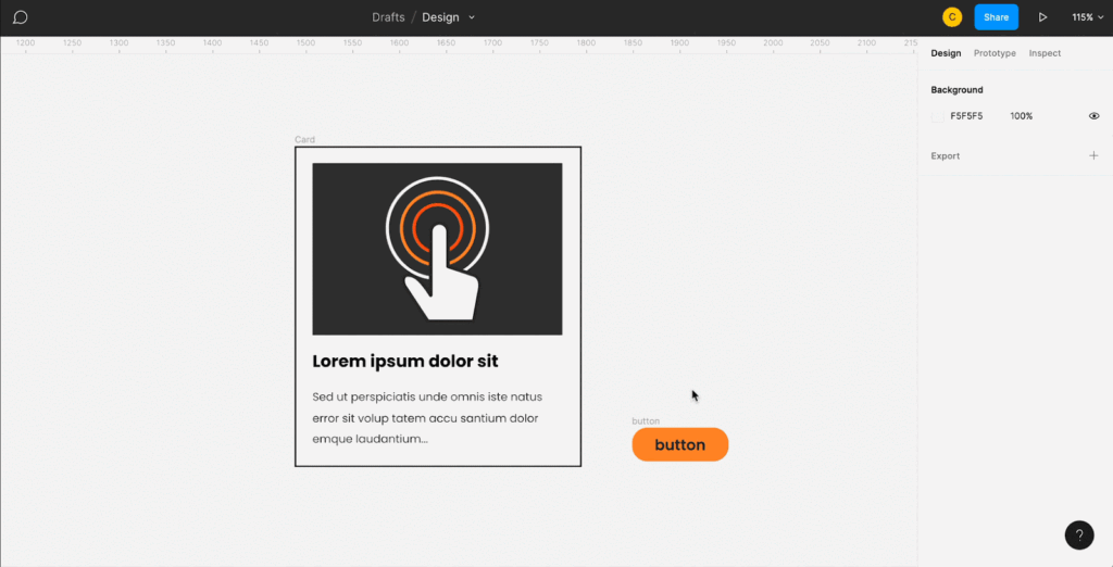
In the properties window on the right side, select a frame, then click the + sign to the right of the auto layout. What’s more, you may use the shortcut shift + A.
#2 Packed and space between
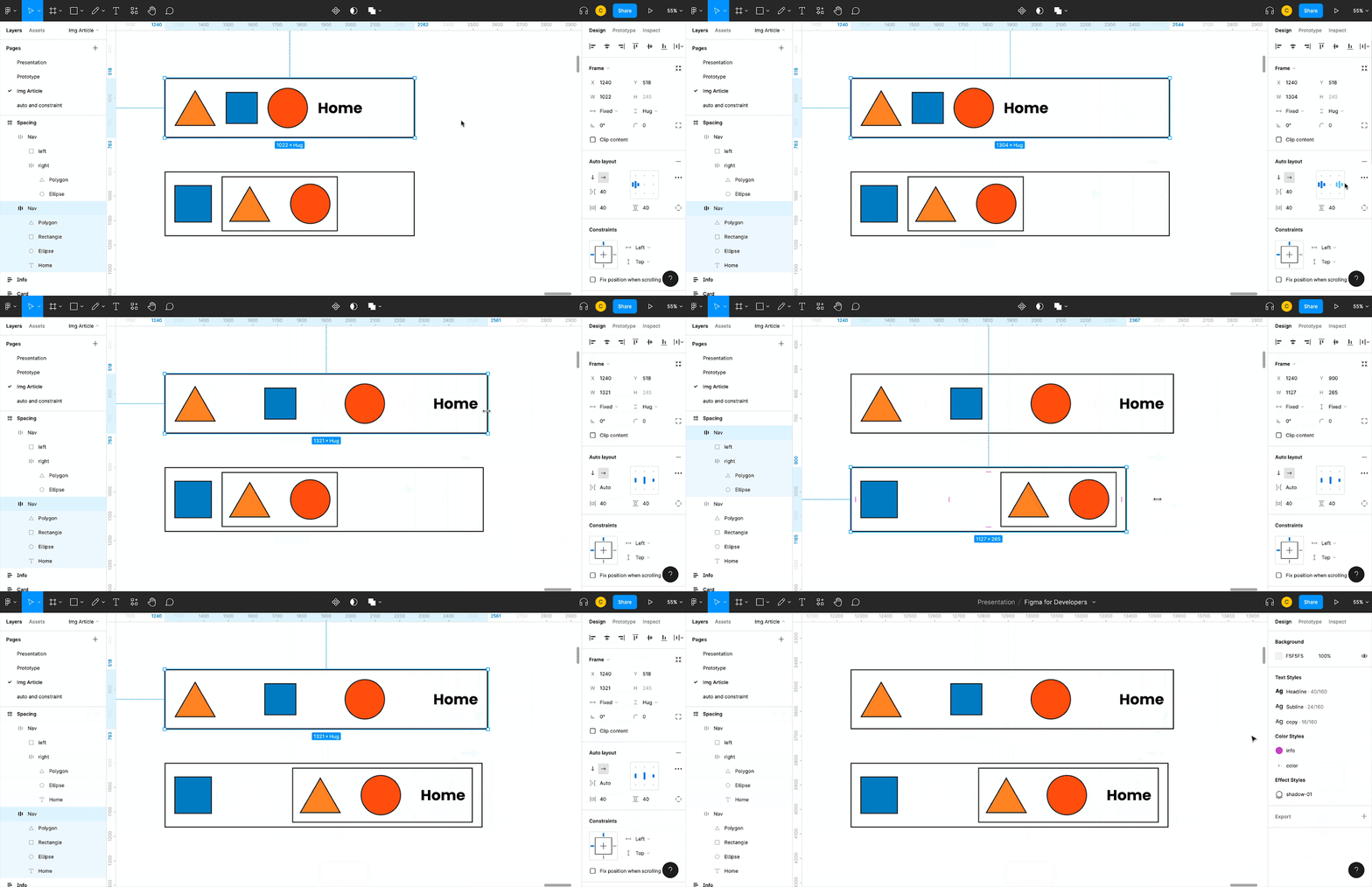
The behavior may be changed from packed to spaced out using the advanced menu. When putting up navigation or nested layouts where you want objects to stay on each side of the frame, for example, you will need this quite a bit.
#3 Padding
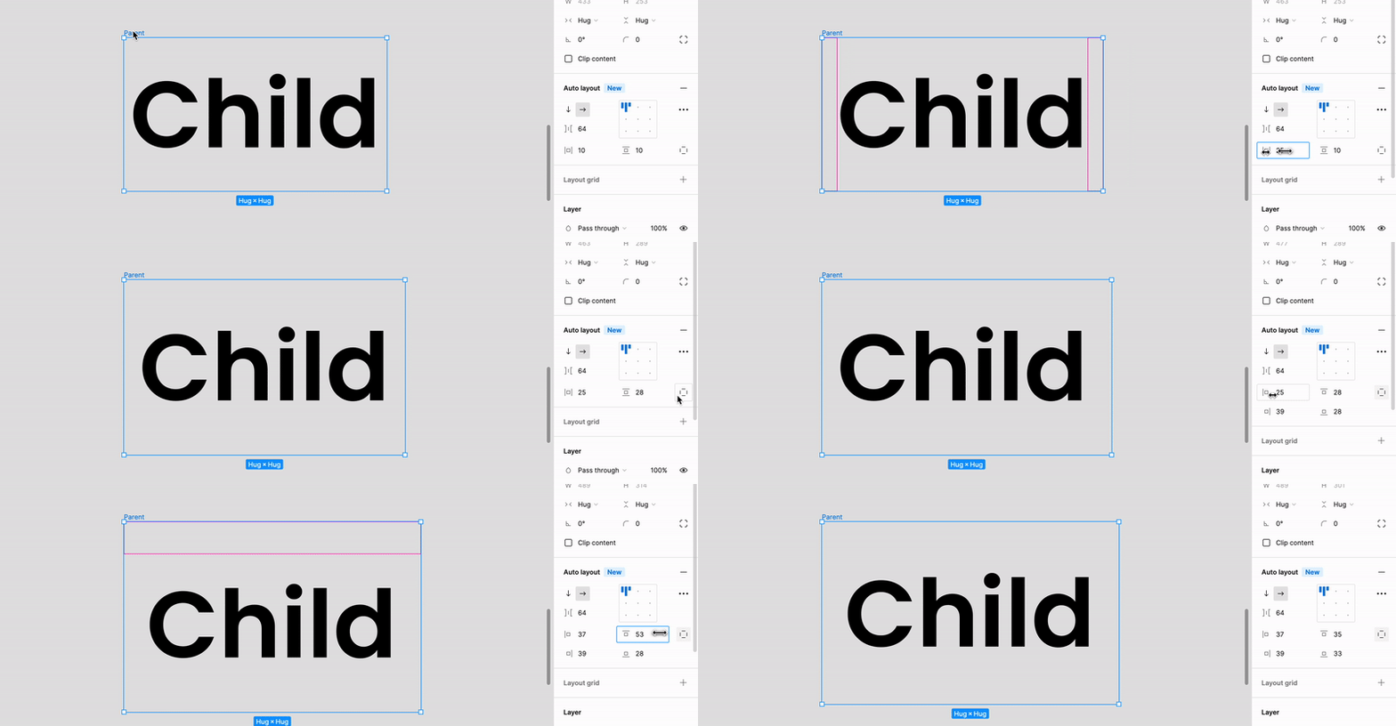
You may adjust the padding for the right, left, top, and bottom of the auto layout in this option. Click on the independent padding icon to create separate padding for each side. You’ll be given access to additional inputs where you may change the padding for a particular side.
#4 Absolute positioning
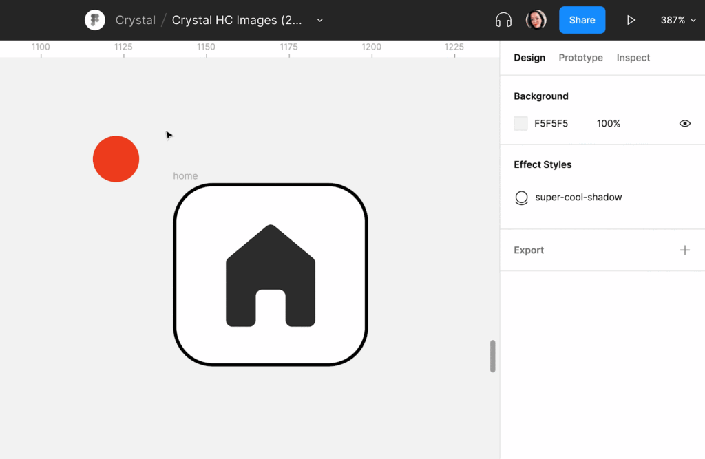
At the top of the right menu, choose the item and then click Absolute Position. This will make this element’s auto layout meaningless, allowing you to position it wherever you choose.
#5 Alignment
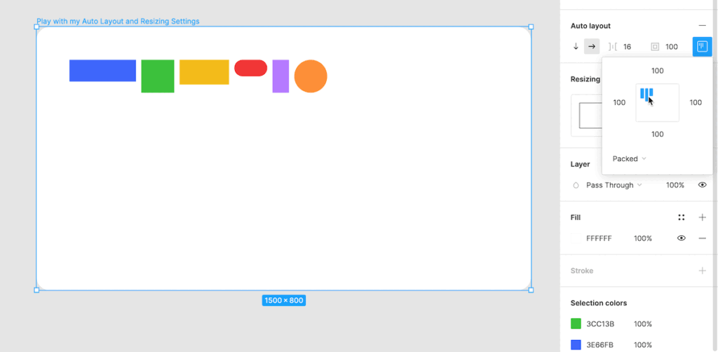
You may align your components directly along the horizontal or vertical axis using this property. You may decide whether to arrange them to the top, bottom, center, left, or right.
Conclusion
Auto layout has many different advantages which it has been widely used currently. Some of the advantages are — Auto layout ensures consistency and accessibility in designs while reducing mistakes and saving time. Consequently, to enhance productivity and produce better designs, designers should utilize this powerful feature.
References & further reads
https://help.figma.com/hc/en-us/articles/360040451373-Explore-auto-layout-properties


