PROBLEMS
The University of Vermont (UVM) is running a research project that aims to determine the effectiveness of rewarding college students as they engage in healthy behaviors through an app. Their existing WE app which was used to gather research data wasn’t performing well, and lacked the vibe to attract the user base of young students. Here are the major challenges Galaxy was asked to solve:
- The app must serve as an effortless platform for collecting fitness research data for UVM.
- The WE fitness app needs to be overhauled to appeal to the age 18 to 24 demographic.
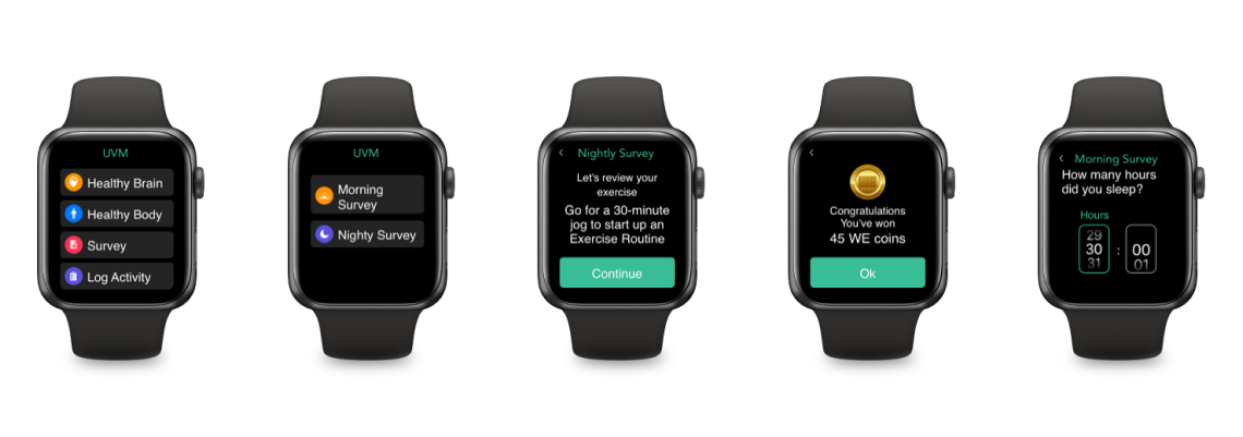
- Need for an exquisitely planned UX for seamless experience with Apple Watch.
- Keeping users engaged and motivated throughout their fitness journey with the app.
SOLUTION
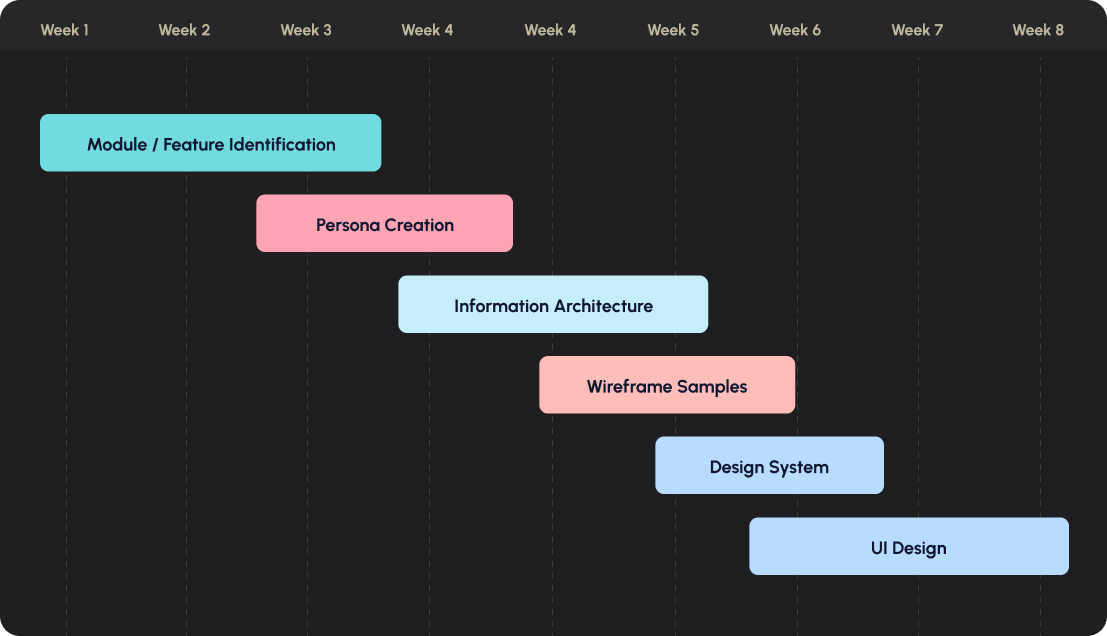
At Galaxy, we followed our ‘6D process’ : Discover, Define, Design, Develop, Deploy, and Drive to solve these challenges. During the discovery phase, we conducted stakeholder interviews and employed data analytics. This helped us uncover problems, discover user requirements, motivations through qualitative & quantitative data.
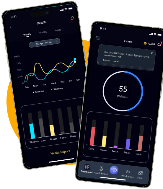
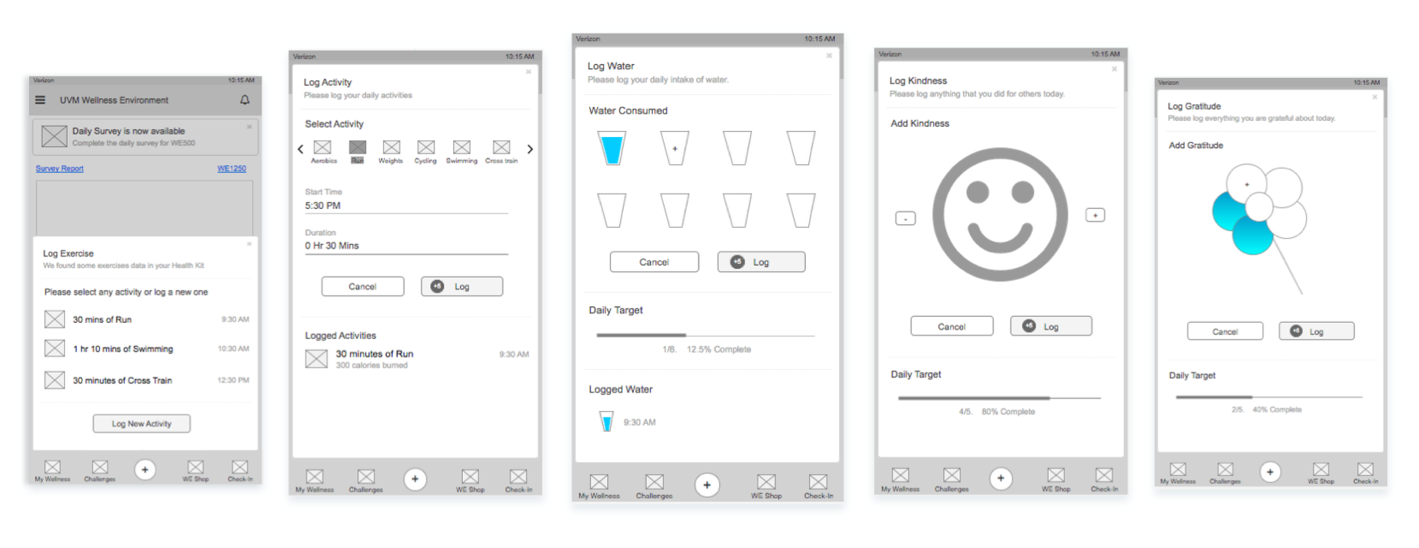
Progress bars are used to get the users into ‘chasing mindset’ as they’re closing in towards their fitness goals. WE app assists and rewards students on the go with seamless experience on Apple Watch.
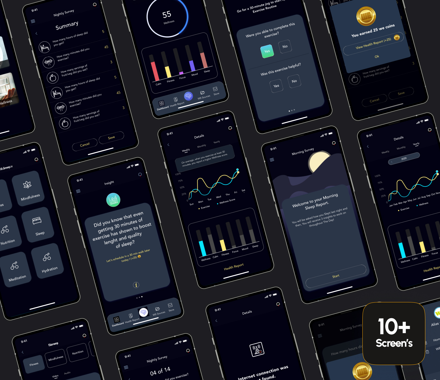
To encourage participation in data gathering and collaboration, we gamified the app with a reward system within the app. “WECoins” would be rewarded for any updates provided by students throughout the day.

