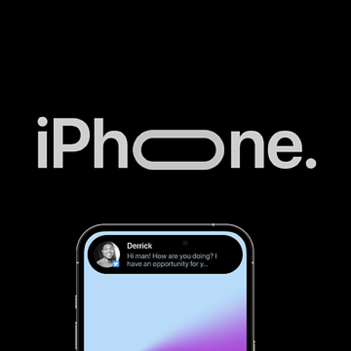
Hello to every iPhone lover and user out there! I know you’re all very excited about iPhone 14’s new Dynamic Island, which is a very attractive feature without a doubt. While being the best update ever for some, it has garnered lots of mixed reviews over the internet. In this blog, I am not going to give any suggestions on whether to buy an iPhone 14 or not. I am just planning on taking a closer look at Dynamic Island from a UX point of view. Let’s jump straight into it!
While some have said that this is an obvious tactic intended to cover up the disappointing surprise, others in the design community see it as the start of the next UX design revolution.
Let’s see why everyone is making a seemingly small UI update a big deal!!
What is a Dynamic Island?
iPhone’s new pill-shaped notch at the top, which expands or contracts based on the action and covers the selfie camera, is known as Dynamic Island. Take a look at the image below for a better comparison of it with the old notch design.
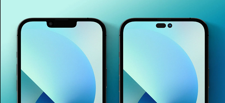
Image Source: 9to5mac
It is obvious
To speak from a user’s perspective, it is not that easy to accept with open arms dynamic islands at the current pricing of the model. Because let’s face it, the user interface hasn’t changed all that much. It is understandable why a significant number of people, be it designers, tech experts, or normal iPhone users, have not been particularly pleased by this surprise. But this has happened several times with the iPhones, including when they changed from rounded to squared-off edges, removed headphone ports, and discontinued providing chargers in the box.
A designer’s take
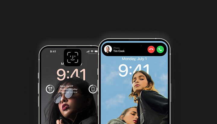
The Dynamic Island does show the notifications with cool motion and also shows live notifications. Like you may touch on Dynamic Island in Apple Maps to get the most recent version of your navigational directions. Additionally, Dynamic Island may display information such as music you are listening to, FaceTime controls, details about particular background tasks, and more. So, it does make using a phone a tad bit convenient.
OK, now let’s check what Apple is saying about Dynamic Island
“The Dynamic Island enables new ways to interact with iPhone, featuring a design that blends the line between hardware and software, adapting in real-time to show important alerts, notifications, and activities.”
Do you feel that the statement Apple gave is satisfying and that is all? I don’t think so !!
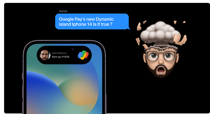
Perhaps. However, I want to draw your attention to one very crucial statement before you decide to dismiss Dynamic Island.
“..featuring a design that blends the line between hardware and software,..”
The idea of fusing physical form and digital form is precisely why Apple has emphasized Dynamic Island so much during the presentation and this is why it will revolutionize UX design in 2023.
The concept of blending hardware and software is super cool and it’s going to be followed by every industry in the future. Though Apple designers always set a pattern like dark more to trendy memojis. Dynamic Island, with all of its hardware and software interactivity, in my opinion, deserves to be in the spotlight!
To talk about connecting hardware and software let’s see some examples like Alexa, smart doorbells, Google nest, etc.
Let’s check how Google’s Nest thermostat connects with the hardware experience.
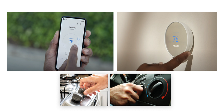
The google nest is designed in a way that we can turn the knob in the device to control the temperature, same in hardware as well as in Nest control mobile application with knob UI.
This is done because the users are used to this action controlling knob to change temperature. For example, in a gas stove, we turn the knob to change the flame, the same as the AC knob in a car. So when this pattern changes the experience of the user will be bad. That’s why when Tesla bought an AC controller in the touch system, we got bad reviews. But Audi’s electric car didn’t. Because the physical devices and digital design of the IoT examples cooperate to offer an experience that follows the natural patterns of interaction.
From this, we may infer that they are well-designed. Hence by using the natural design pattern in the product UX it becomes successful. When Apple started to update their phones, they tried to make the screen bigger every time. In 2017, Apple introduced a notch in iPhone X, which eventually got bad reviews and in the end, every other mobile industry brought this notch to their mobile, which made Apple successful.
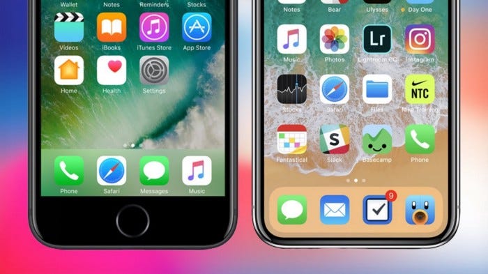
It’s been no solution for the industry to remove the selfie camera, it should be hardware there. So Apple has come up with a solution that initially gets bad reviews but I hope history repeats itself.
A few problems accompanied the notch’s debut. First and foremost, designers now have to contend with a screen that has a number of strange requirements. When it comes to full-screen, a few of the old safe area zone concerns are where the largest troubles occur.
Designers have had to account for the notch from its conception, but it’s not been a significant difficulty, but designers managed and the notch stays in one location and doesn’t move about, so it’s been quite straightforward to design for with reasonable adaptation.
Issues encountered
Let’s take a look at some potential issues that the widespread use of Dynamic Island may cause.
- Every design team in the world will have to deal with a new non-branded element that will hover above their users’ experiences as a persistent call to action.
- Every time Dynamic Island opens, it will steal the consumers’ vital attention, which every product is trying so hard to get.
- Your designs will now need to account for anything “notch notification” and ensure that, if Dynamic Island is open, it doesn’t replace your content.
- Every user of this DI feature will need to constantly assess the condition, what is happening with it, and whether it pertains to what they are attempting to perform in their chosen app.
Do you see the issue with this? It isn’t an atomic design. Although it is a component functioning apart from the existing user experience, it may not be connected to the present UX. So, now the designers out there have their products with good UX and UI in hand but have to give an update to their products, which causes their product team lots of effort and financial beatings.
Some additional disadvantages designers have encountered:

Users may accidentally touch the camera which can cause smudged images.

And also, according to Steven Hoober’s research 75% of the users touch their screen with only one thumb and our screens got bigger, and the top part became virtually impossible to touch without adjusting your phone. And dynamic Island is in the red zone. Do you think Apple doesn’t consider this ?? Leave me a comment and tell me what you feel about Dynamic Island

Closing Thoughts
Without a question, I can assure you that there will be certain benefits, but I can’t promise how such a Dynamic Island will affect people who are currently overburdened with fairly close interrupts, diversions, and breaks in their attention. And dark mode is going to be a challenge to overcome for the designers for sure. With this, I hope the most beloved brand known for its groundbreaking design revolutions keeps giving us the best design solutions.
References —
https://www.apple.com/newsroom/2022/09/apple-debuts-iphone-14-pro-and-iphone-14-pro-max/
https://www.carthrottle.com/post/how-do-climate-control-and-air-conditioning-systems-actually-work/
