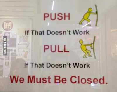
Did you ever use a product and couldn’t figure out how to use it or what to do with it? Like tried to twist the cap of the bottle to open it, but the cap was made to pry off. Or went somewhere and pushed a door when it was meant to be pulled or vice-versa?

This is because of a lack of sign about how to use the product or what to do with it. Because of this sometimes we try every possible action we can to make it work, which is a frustrating experience.
What are Affordance and Signifier?
In 1966, Psychologist James J. Gibson coined the term “Affordance” which is what the environment offers the individual. Don Norman later popularized the term in his book, The Design of Everyday Things. You can see examples of affordance everywhere. It may be a door that affords to open or a pencil that affords to draw.
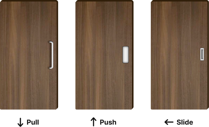
Don Norman also introduced the term “Signifier” in his book, which is some sort of perceivable cue about affordance. Signifiers tell you about the possible actions and what to do. For example, we know that the door affords to open, but how it will be opened? By pushing, pulling, or sliding? a proper handle acts as a signifier here which helps to use it.
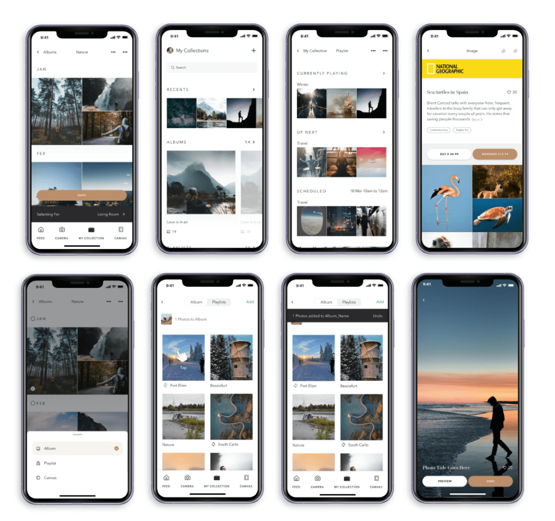
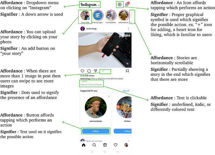
In digital products, the user interface is a way of communication between the user and the product. The interface communicates its interaction possibilities with the help of understandable cues. These interaction possibilities are affordances and clues with the help of which we identify these possibilities are signifiers. let’s take the example of Instagram which most people use daily.
Conclusion
Affordance is an important concept in UX design, and Signifier is also equally important to finding out those affordances in design. Designing the right affordance and signifier helps users to accomplish their tasks quickly with minimal difficulty and error.
