Information Architecture (IA) in UX design is the process of organizing, structuring, and labeling content (e.g., information, data, and media) in a way that is intuitive, understandable, and easy to navigate for users. IA helps users to find what they are looking for, and it also helps to communicate the relationships between different pieces of information. In order to design an IA that meets the users’ expectations, users group subjects using the UX research technique known as Card Sorting.
Importance of Information Architecture
By establishing a hierarchy of information and connecting various bits of information to one another, information architecture (IA) improves the intuitiveness and usability of a website. Without the proper IA, users can become frustrated or confused, resulting in a poor user experience.
Overall, IA is an important aspect of website and application design that can have a significant impact on usability, engagement, and business success.
Benefits of Information Architecture (IA)
There are several benefits to having a good information architecture (IA) design:
- Enhanced usability: A strong IA design makes it easier for users to quickly and easily find what they’re looking for.
- Increased efficiency: A well-designed information architecture can boost productivity by cutting down on the time users spend looking for information.
- Improved organization: The IA’s design makes sure that content is arranged logically and intuitively, which makes it easier for users to learn and explore.
- Improved Search Engine Optimization (SEO): A well-structured IA can help with SEO by making it easier for search engines to index and categorize material.
- Better decision-making: A well-designed information architecture (IA) can assist businesses in making better decisions by revealing how users classify and organize information.
Why do we do Information Architecture (IA)?
Information architecture testing’s ultimate goal is to increase content discoverability and help users in discovering what they’re looking for on an app or website. For digital content or information to increase user experience, usability, accessibility, discoverability, and search engine optimization, it must have a clear, well-organized structure. It is an important step in the design process that can have a significant impact on the success of a digital product or website.
What is Card Sorting?
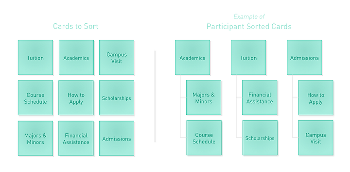
In order to design an IA that meets the users’ expectations, users group subjects using the UX research technique known as card sorting. Whenever a team wants to organize and label content on a website in a manner that the target audience will understand, they use this technique.
Getting users to organize information into groups that make sense to them is the aim of card sorting. There are a few specific sorts of card sorting, each one is used in unique contexts to gain user understanding.
- Open card sorting: In this kind of card sorting, participants arrange issues into categories that make sense to them and then give these groups their own names.
- Closed card sorting: With this kind of card sorting, you give the participants a list of categories and ask them to arrange the cards within those categories in a way that makes sense to them.
- Hybrid card sorting: This particular card sort combines the techniques of open and closed card sorting. A group of cards can be sorted into predetermined categories, but participants can also make their own.
The Importance of Card sorting:
Card sorting is an important technique used in information architecture (IA) that can provide valuable insights into how users think about and categorize information.
Here are some reasons why card sorting is important:
- User-Centered Design: User-Centered Design (UCD) is a method of product design that centers the design process around the needs, preferences, and behaviors of users. It entails comprehending the objectives and behaviors of users in order to build products that satisfy their requirements in an easy, natural, and enjoyable way.
- Improved Navigation: Design professionals can employ map sorting to produce a user-friendly and intuitive navigation system. Users can discover the information they’re looking for easily by classifying the material into useful categories and subcategories rather than becoming lost in a complex navigation system.
- Content Organization: Designers can also find portions of their content that are difficult to understand or navigate by implementing card sorting. By making changes, designers can guarantee that their content is arranged in an understandable way.
- Testing Existing IA: An existing IA can be checked to determine if it functions as expected using card sorting. Users’ comments on the present structure help designers make adjustments and improve the user experience.
Advantages and Disadvantages of Card Sorting
Here are some of the main advantages and disadvantages of card sorting:
Advantages
- Easy: Both the organizer and participants find card-sorting studies to be simple.
- Cheap: minimal cost for setup.
- Quick to execute: Many types can be completed rapidly, giving you access to a wealth of valuable insights.
- Involves users: The mental models of consumers for website content and logical content organization are shown through studies.
- Provides a good foundation: Card sorting works well as a way for determining the structure of a website or product as well as for evaluating label quality.
Disadvantages
- Tags are not displayed in context: Which reduces their effectiveness in reliably expressing meaning.
- Various outcomes: The outcomes of the card sort may be remarkably uniform or vary significantly among participants.
- Time-consuming analysis of results: While the initial setup and sorting can be completed rapidly, data analysis can be challenging and time-consuming, especially if the results are unreliable.
Information architecture vs Card sorting

Information architecture and card sorting are both important techniques used in user-centered design.
Information Architecture
- Focuses on how information is arranged, labeled, and structured to make it easier for users to access and understand.
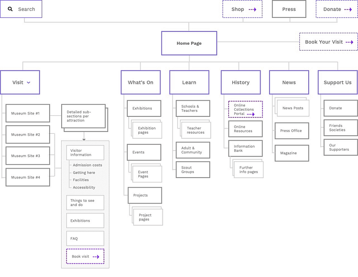
- Involves developing an information system’s overall conceptual model, which should include site maps, menus, and content hierarchies.
- Aims to build an information structure that is logical and easy to use and supports user demands and tasks.
Card sorting
- A method of user-centered design used in the early stages of design to understand the mental models and preferences of users.
- Involves making a number of information-representation cards and asking users to organize them into groups that make sense to them.
- The categories that result can offer informative information about the mental models and preferences of users, which can subsequently be utilized to guide the design of the information architecture.

In summary, whereas card sorting engages users in the process of organizing and categorizing information to support the design of the information architecture, information architecture focuses on developing a logical and understandable structure for the information system.
Conclusion
Card sorting and information architecture are effective methods that can significantly improve a website or app’s user experience. Users can access the website and app more easily by building a structure that is intuitive and simple to navigate. Product owners may enhance search results, increase interaction, and organize their material better by putting these strategies into practice. IA and card sorting together are potent tools for building a user-friendly and successful website.


