Brad Frost, a passionate young man is the one who deserves credit for the system we are about to discuss in this blog; Atomic Design. His insightful book, Atomic Design by Brad Frost explores the concept in great detail. Atomic Design was born out of a desire and necessity to have a responsive digital environment.
For years, we have been creating style guides, elemental guidelines, mood boards, and various other tools to make our designs more understandable and comprehensive. Developers, meanwhile, have been embracing technologies like Bootstrap, Foundation, Bourbon, and others to make their lives easier when it comes to coding. However, we need compromise and collaboration to make life easier for designers and developers. Atomic design is here to help us with that.
As a famous saying goes,
“We’re not designing pages, we’re designing systems of components.”
— Stephen Hay
Atomic Design
Atomic design is a process that consists of five separate steps that work together to build more coherent, hierarchical, and thoughtful interface design systems.
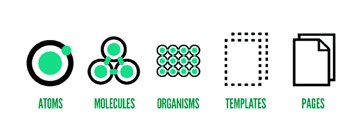
The following are the five stages of atomic design:
- Atoms
- Molecules
- Organisms
- Templates
- Pages
Intriguing right? Let’s learn how this chemistry analogy helps us in creating a comprehensive system in design.
Atom
In science, an atom is the smallest unit of matter that makes up a chemical element, as well as the smallest unit of a cell. Every solid, liquid, gas, and plasma is made up of neutral or ionized atoms.
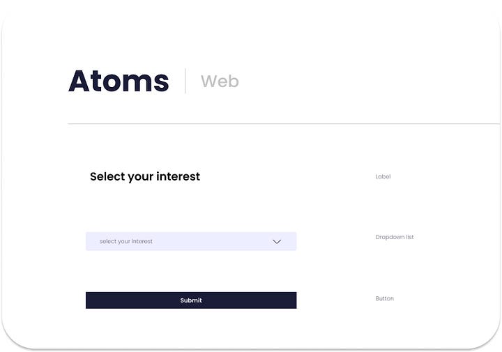
Similarly, in design, atoms are the most basic components. They are the building blocks of design such as buttons, lines, shapes, icons, text fields, text labels, etc.
Molecules
Molecules are the group of atoms bound together to be the smallest fundamental unit.
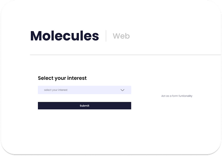
In design, a molecule can be created by combining two or more atoms. For instance, an input field and a button can combine to become a search form, which can perform the search function on the interface.
Organisms
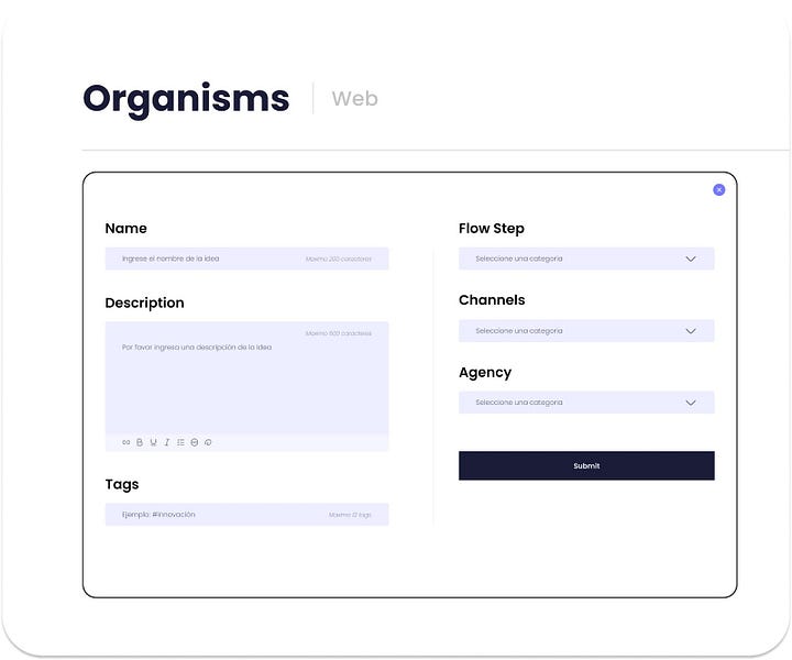
Molecules provide us with a basic unit or building block for designing further. Multiple molecules can combine to make an organism. An organism is a collection of molecules that have been bonded together to form complex individual portions of the design such as a login page, form, etc.
Templates
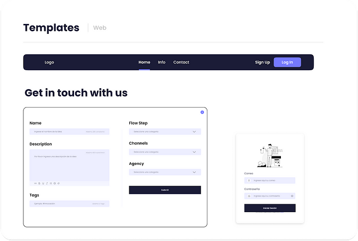
Templates are the glues that combine the different organisms or individual sections to create a complete design. For example, the search form (organism) can be used as a template in the hero section of our home page to fetch user information. Multiple such templates, like a login form, carousel, etc. can co-exist to create an interface design.
Pages
Pages have the highest level of fidelity. As they are highly palpable, most individuals spend most of their time on pages during the process.
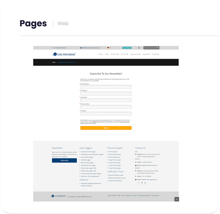
The page stage is critical since it is here that we test the design system’s efficacy. By seeing everything in context, we can go back and tweak our molecules, organisms, and templates to better address the design’s genuine context.
Applying Atomic design
Applying atomic design is easy. All we have to do is put it together and work with it. Start with designing atoms and gradually move to templates and pages, having in mind the principle of building up. It is always helpful to start by first mapping out the foundational elements i.e., atoms, and build your system on them.
Why you should follow the atomic design?
Design once and reuse whenever you want
It’s simple to see what elements of the site may be reused and how they can be combined and matched to construct other molecules and even organisms by breaking down components into fundamental atoms.
Creating a style guide is easy
All the atoms and molecules that are developed before the site is built can serve as a basic style guide if a site is designed using Atomic Design principles from the start. Even for sites that haven’t been developed atomically, extrapolating the fundamental components and putting them together to create new pages isn’t difficult. Also keep in mind, that it’s always better to build a site atomically from the start rather than trying to apply atomic design concepts later.
Understanding the layout is easy
An atomically constructed website’s code is usually considerably easier to comprehend than one built more conventionally. This is true not only at the moment of creation but also in the future when a site is referenced or tiny changes are made.
It’s easy to figure out what each component of the code represents thanks to the documentation on which atoms, molecules, and organisms are employed and where. This has the added benefit of making it easy to explain the codebase to a new developer.
Prototyping becomes easy
When you have a list of atoms before you start building your site, you can quickly and simply mock up pages. All you have to do is choose and combine the essential pieces for the page. For the final site, the mockup may be customized and enhanced.
Easy in updating and removal
It is simple to verify that any adjustments to a component are transferred to all other instances across the site because only one atom, molecule, or organism is being altered at any given time. Unwanted components can also be readily deleted.
Conclusion
As a designer, you need to know the atomic design system to make your work easier and reduce the time and effort invested into designing drastically. There are many free UI kits to start with your design system.
Thank you for reading my blog and hope you have gained some valuable design knowledge.
References:
https://atomicdesign.bradfrost.com/chapter-2/
https://medium.com/@skaurgupta/5-things-to-know-about-atomic-design-b8d0b1c1d355
https://medium.muz.li/building-design-systems-with-atomic-design-93a13286f676
https://tiagoalexandrino.medium.com/ux-ui-explained-atomic-design-5253a95f2b32


