What is a microcopy?
Microcopy or small pieces of text are the messages for digital solutions such as apps or websites that guide people to take action while using them. These are small bits of messages which help users to do certain things. These can range from error messages to labels, and e-commerce hints. If done thoughtfully, these words have great potential of improving user experiences and digital conversions.
Microcopy is UX writing, but not all UX writings are microcopies. UX writing is a much broader concept, focussing on end-to-end user journeys than microcopy which guides users toward particular goals. Microcopy is something added in the last phase of the writing and research process.
History of microcopy
Microcopy was one of the most neglected parts of UX design. For example, most of the error messages were cryptic and technical to a fault.
Not a great alert even for the brightest out there. Messages like this make end-users confused, annoyed, or worried.
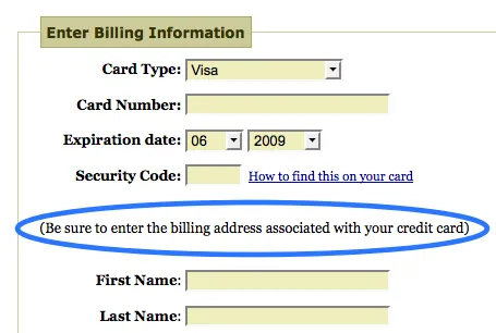
One day Joshua Parker noticed that many people were getting stuck on a check-out page since they entered the wrong address. So he added an additional text “Be sure to enter the billing address associated with your credit card” and boom! Problem solved, revenue increased.
This story was shared in 2009 in his famous blog Writing Microcopy. He also mentions that
“Microcopy is small, yet the value it adds is enormous. And not to judge it on its size, and judge it on its effectiveness.”
Some examples of using bad microcopy
Not all microcopies fulfill their objective. Some are difficult to understand and might have a different tone and scare the users. Here are some examples of how not to use microcopy.
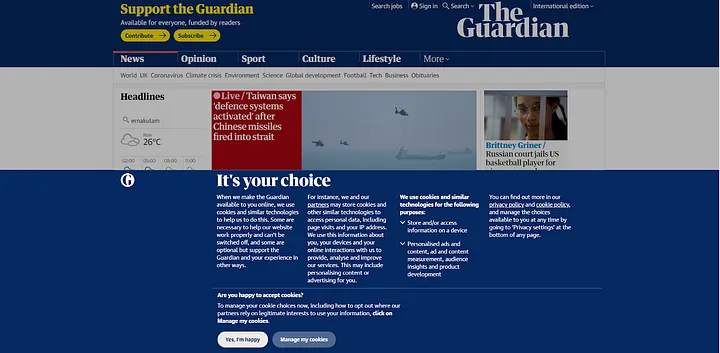
This is a news website, you might be trying to read a particular headline or article. But suddenly this popup covers more than half of your screen. And the copy on it is never ending, it shows a lot of content thus confusing the user. And the call to action is “confirm shaming” the user. It makes the user do an action by manipulating the terms and invoking guilt. This is a dark UX pattern as well.
This cancel prompt is equally funny and sad. It is funny to read, but it is sad since it probably has the user a hard time. This also happens when you keep writing and adding words to your microcopy, it becomes larger and no longer remains micro. So, keep it concise and clear. Be empathetic, would you like this if you are at the receiving end of this message?

Again, the prompt reminds me of this hilarious scene and meme from the movie “Rush hour”.
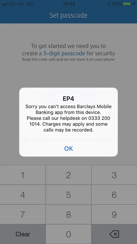
For a person trying to access their bank account this message comes as quite a shock. It does not mention why the app can’t be accessed. And also there is no report/share feedback button on this screen. You have to call that number in order to get support and understand the issue.
Smart ways of using microcopy
Microcopy is often used in onboarding, error, success, tooltips, etc to encourage users, gain their trust and empower them in the process. Building customers’ trust is the most essential part. Due to the rise of online shopping, classes, meetings, etc, people spend a long time on digital products. And the majority of the users are using these services for the first time. They are afraid of getting scammed, having privacy issues, or spam messages. It is up to us to create an engaging microcopy that assures users that this is a safe place to be and guides them toward their goals.
So how do we create an effective microcopy?
1. Audience
Once we have written a proper microcopy throughout the page, the next part would be to test and refine the copy. If we are going for a playful tone, we would be adding microcopy which is witty, but if the users do not get the joke, then we are at a loss.
2. Compact
The copy should be short and clear. It should not have a lot of words or technical jargon to confuse the user.
3. Context
Every message we write should have proper context. Imagine if we write out-of-context CTA, it will puzzle the user and we have only ourselves to blame for the lack of engagement.
4. Building trust
As mentioned previously most of the users is very skeptical of the different actions in the web/mobile apps. And in some scenarios, the copy on the page might make them quit the app and go elsewhere. We need to reassure them that the platform is safe and free of any malicious intent. And this trust-building can be done with small steps only.
5. Guidance
Along with building trust, proper guidance needs to be given to users. This is more the case for new users. We need to make sure they don’t get stuck in attaining their goals.
6. Goal
What is the goal of the user? It changes based on the page, app, or website. If the goal of a user is to purchase a t-shirt, we shouldn’t make the “Add to cart’’ and “Wishlist” buttons confusing. Sure, we can write “on to the spindle”, but it would probably confuse them. Our success depends on users reaching their goals.
7. Test
Once we have written a proper microcopy throughout the page, the next part would be to test and refine the copy. If we are going for a playful tone, we would be adding microcopy which is witty, but if the users do not get the joke, then we are at a loss.
So what are some examples of good microcopy?
Feast your eyes on some of the best microcopies I have observed in some of the services I have used.
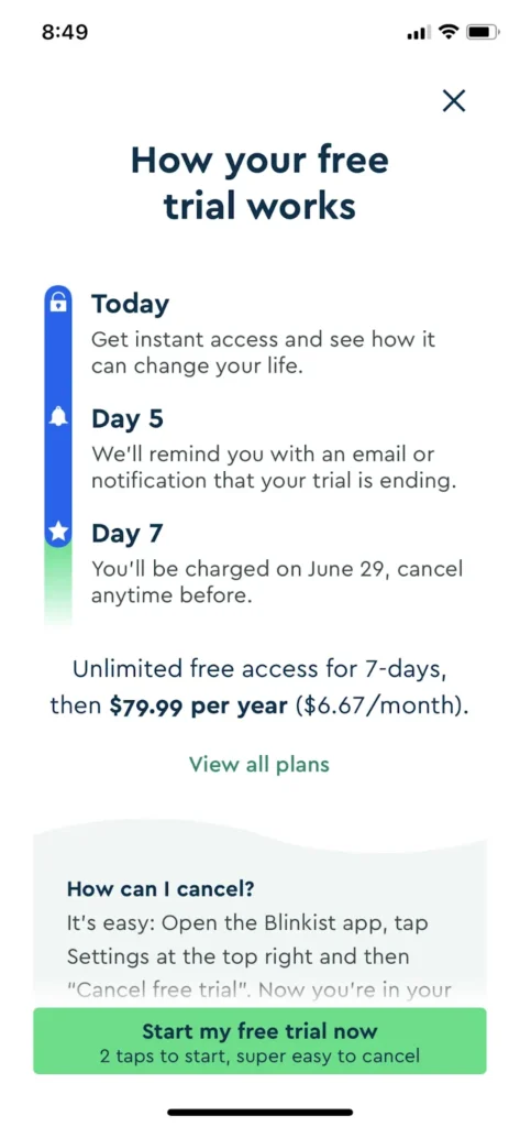
Here Blinklist goes with a fully transparent approach of sharing how the trial works. Rather than saying that your trial will cost so and so and forcing the user to start the trial. They share the date of charging, the reminder before charging, and also steps to cancel if the user wishes to cancel the trial. This reassures the user that, this decision is safe and can be easily reversible.
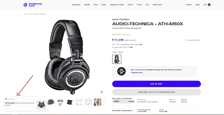
This is a great example of microcopy motivating the user to feel good above this product. When a notification shows that certain number of people have viewed it, it also drives a dopamine effect. This slightly pushes us towards the purchase decision. We usually purchase popular things since it is mostly well built and reviewed.
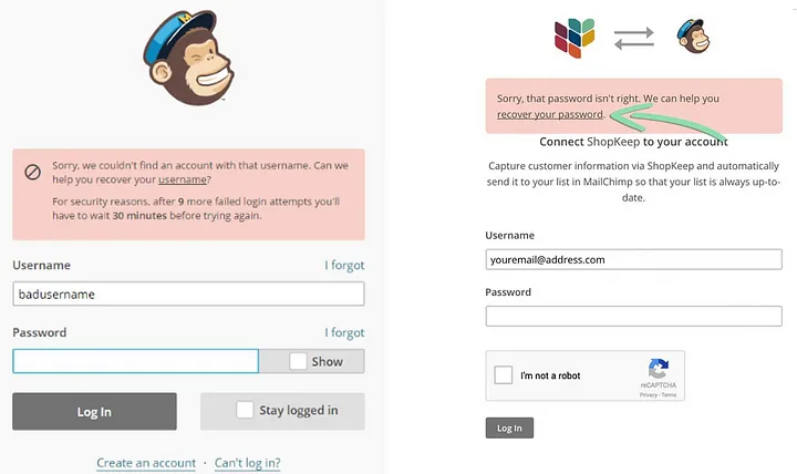
Here MailChimp is extremely empathetic in helping the user to find their user name and recover their password.
To summarise
Microcopy needs to be short and clear without any technical mambo-jumbo. The context need to be clear so that user can follow along easily. We will be guiding our users towards an action. The messaging need to be consistent with the tone and be reassuring at the same time. Once we create the microcopy, the next stage is to test it out on users and see how their response changes.
References
https://uxwritinghub.com/what-is-microcopy/
https://www.toptal.com/designers/ui/microcopy-impact-ux
https://uxplanet.org/microcopy-tiny-words-with-a-huge-ux-impact-90140acc6e42
https://xd.adobe.com/ideas/process/information-architecture/four-cornerstones-writing-ux-microcopy/


